Welcome to my personal website showcasing some of my design work as well as sharing a little bit of information about myself. Thanks for visiting!
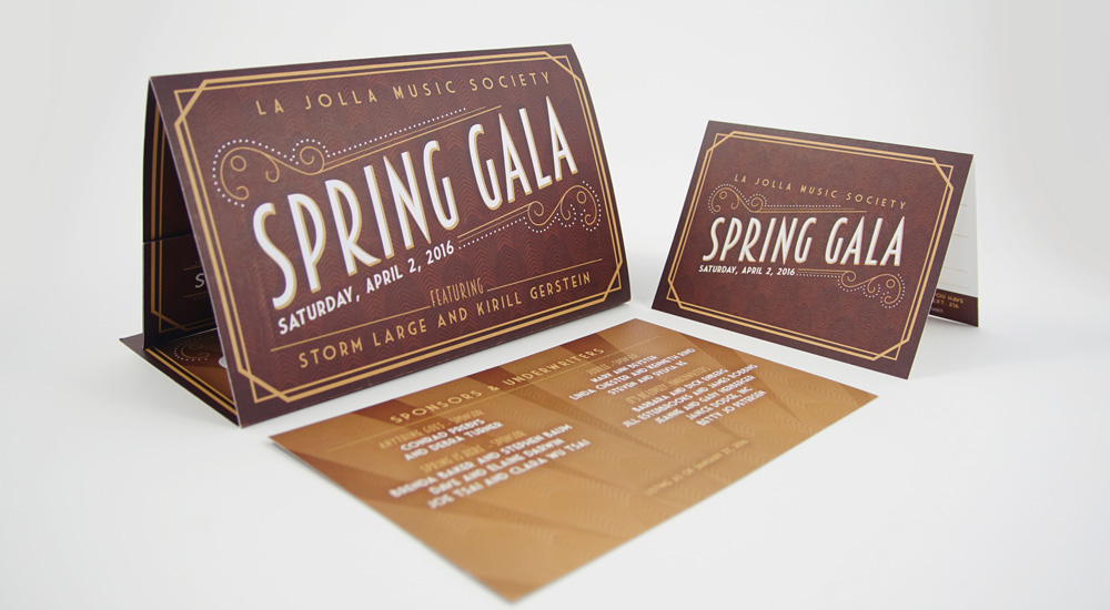
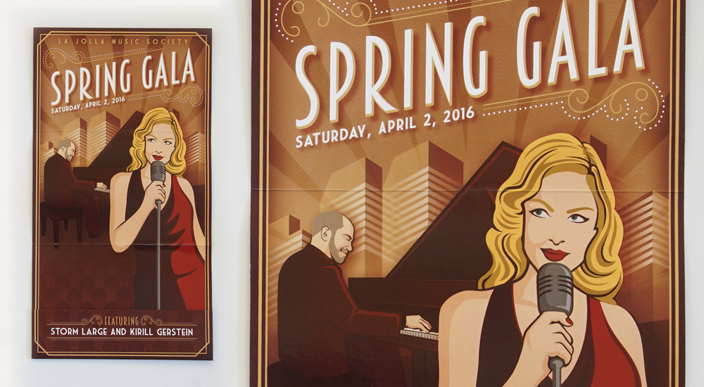
Spring Gala 2016
Spring Gala Invitation
Inspired by various vintage illustrated posters, I created a custom illustration of Storm Large with pianist Kirill Gersterin, who were the featured entertainment, in front of a generic cityscape. The folded invite has a pocket at the bottom containing information cards along with a reply card and envelope.
Shaolin Warriors Graphic
Not a typical performance in La Jolla Music Society's Special Event series in 2012-13, I needed to create an appealing and exciting graphic, targeting a younger audience, to generate interest for the event. It included the development of a logo and the combining of two images to create a dramatic and exciting visual. This design was used in posters, flyers and a rack card.
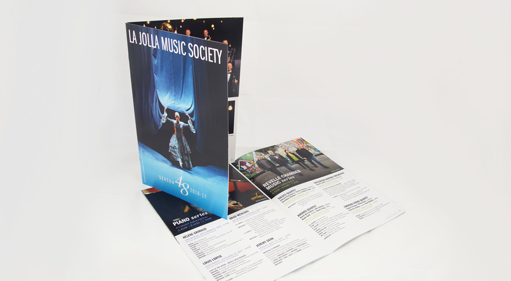
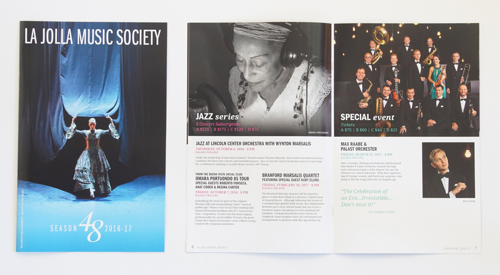
Season 48 | 2016-17
Subscription Brochure
The subscription brochure for the upcoming 2016-17 Season. I wanted to combine large interesting images with more white space, creating contrast with the content, I then used different colors for each series/page to highlight important bits of information and to also contrast the usually dark images
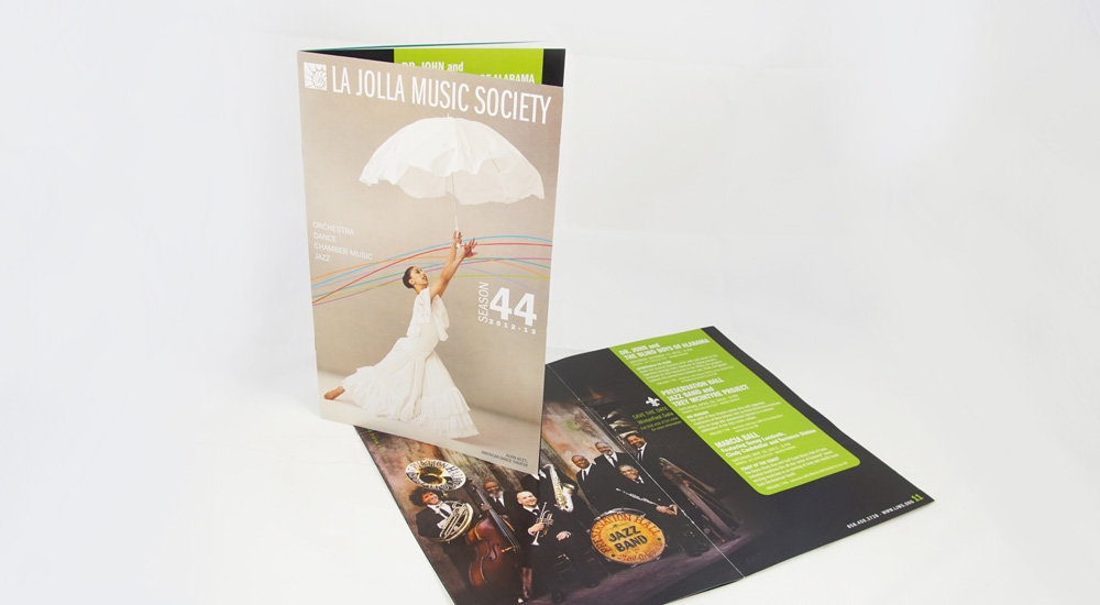
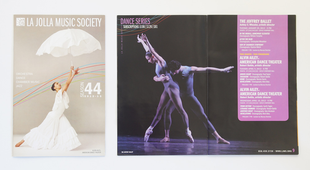
Season 44 | 2012-13
Single Ticket Brochure
The single ticket brochure for the 2012-13 Season, I used swooshing colored lines on the cover to help create movement and I then carried them through the top corners of each spread to tie the theme together. Each colored line also related to a performance series and was used for the colored background text box on each spread to further the connection. I then wanted to focus on one large image per series to create impact on the spreads.
Rowdy Beard Bros.
Logo design for a startup company specializing in beard products. I researched vintage photographs for inspiration when coming up with the main illustration for the logo, I added the sunglasses towards the end of the design process to add a modern touch. Rowdy Beard Bros. products are sold online through their website as well through amazon.com
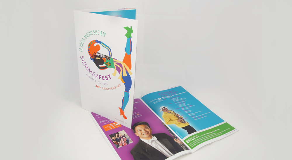
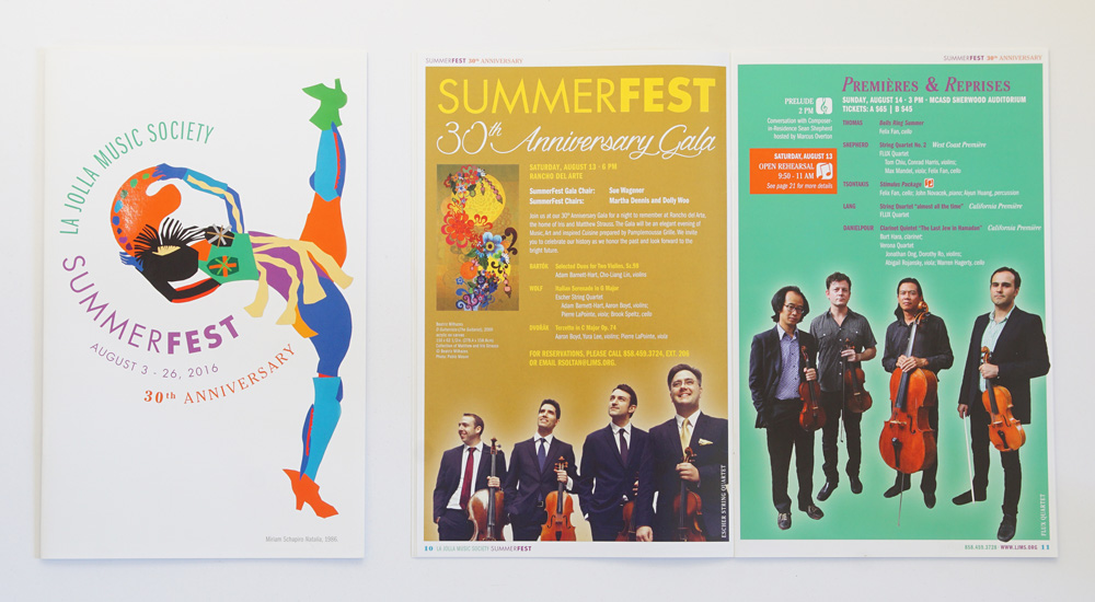
SummerFest 2016
Single Ticket Brochure
The SummerFest 2016 Single Ticket Brochure is part of a series of printed pieces featuring artwork chosen in partnership with MCASD, La Jolla. In past years the artwork was generally square/rectangular shape, this years provided opportunity to really break the standard mold and have the text move around the art, creating a fun and interesting cover. I also wanted to carry the idea in a way through the brochure, cutting out the artist images and placing them on colored backgrounds.
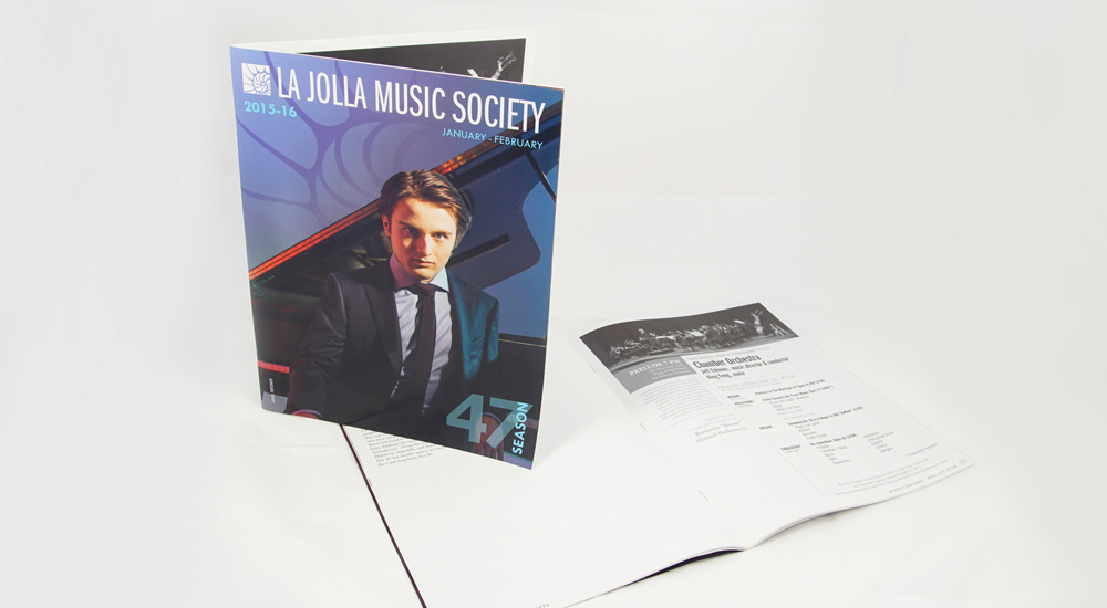
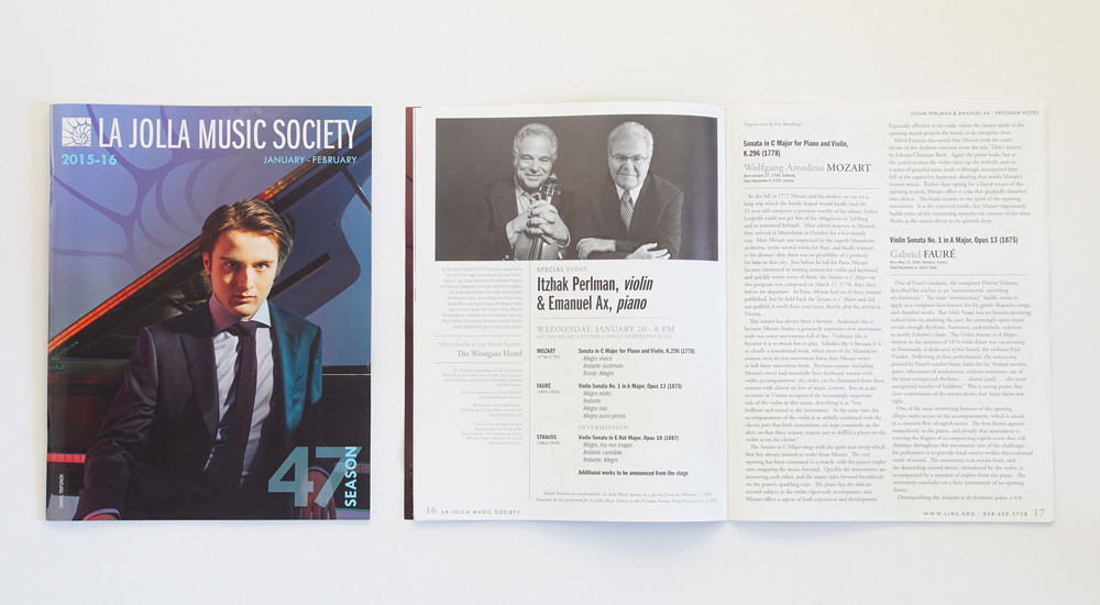
Season 47 | 2015-16
Program Book 2
One of 3 program books created for the 2015-16 regular season, I wanted to create bold covers to contrast the text heavy black and white insides.
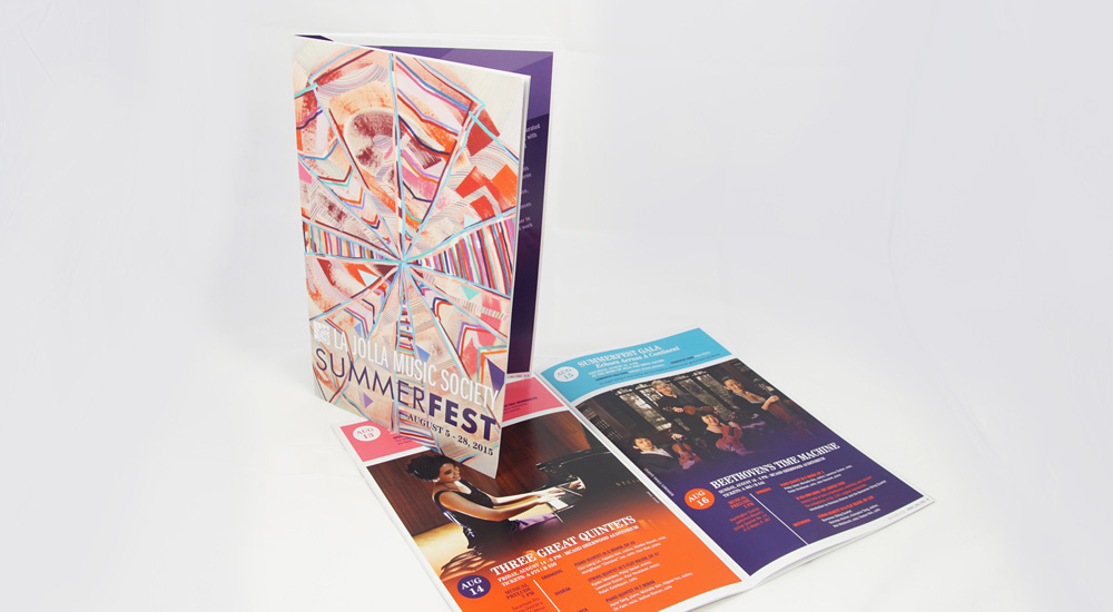
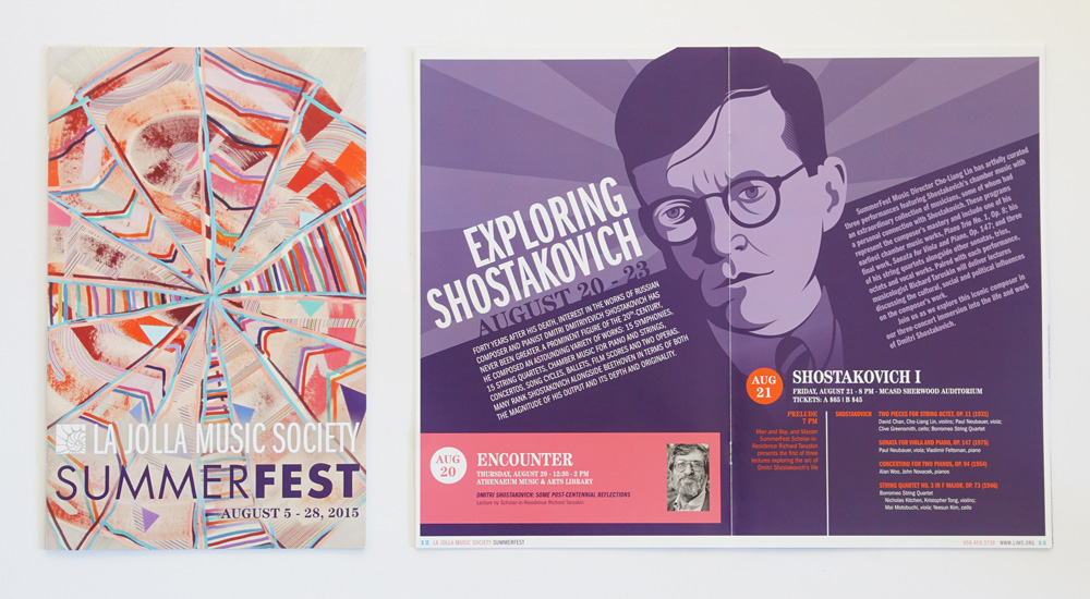
SummerFest 2015
Single Ticket Brochure
I wanted to use bold contrasting colors for this piece along with large images that faded in to the background. I also had the chance to do a custom illustration of Dmitri Shostakovich for a special spread highlighting a three concert Shostakovich mini series.
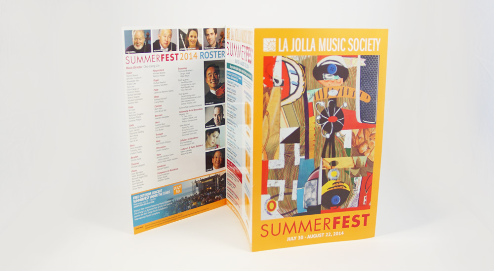
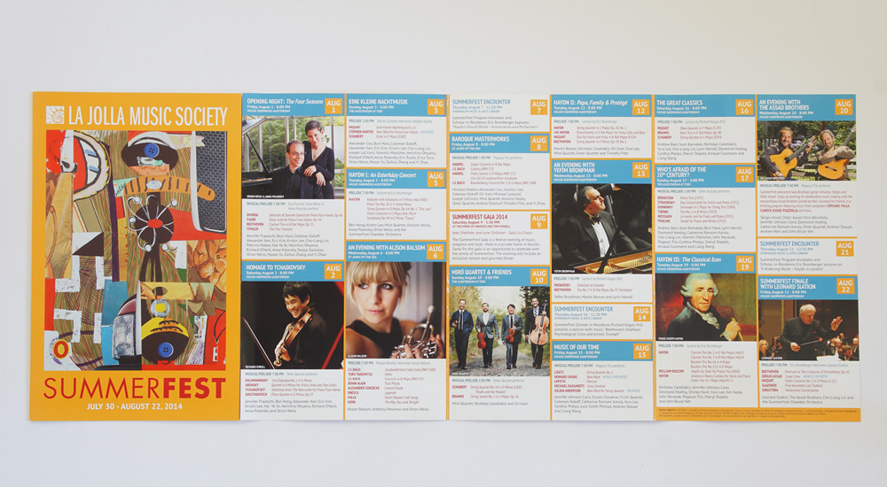
SummerFest 2014
Subscription Brochure
Featuring artwork chosen through a partnership with MCASD La Jolla, I decided to balance very active cover with a simple, clean yet colorful and playful inside.
Siro-A Graphic
Similar to the Shaolin Warriors performance years before, Siro-A was not a typical performance for La Jolla Music Society, so I needed to create an interesting and compelling graphic which could be used in a variety of formats to promote the event. I wanted to combine a tech look with the background being a scan of a circuit board and utilizing the one main image I created multiple outline versions that I offset to create the feeling of movement and energy. This design was used in posters, flyers and web ads.
Israel Philharmonic
Orchestra Flyer
With the opportunity to do a flyer insert in the New York Times for this exciting performance, I needed to create an engaging piece that showcased the well known music director but still gave presence to the orchestra itself.
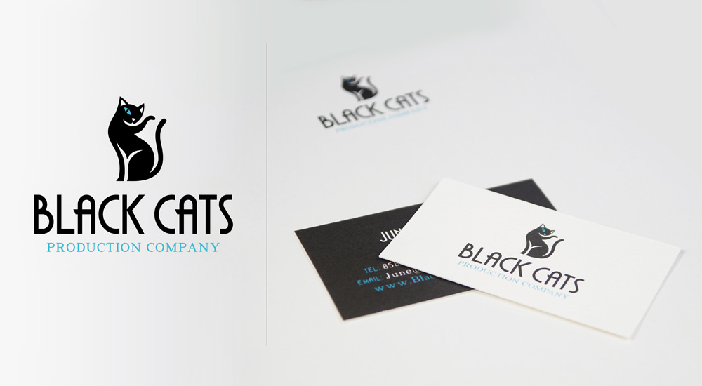
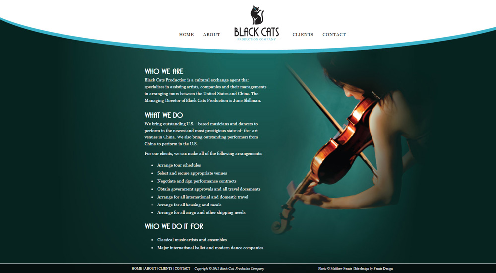
Black Cats Production Company
Black Cats Production Company is a cultural exchange agent that specializes in assisting artists, companies and their managements in arranging tours between the United States and China. This project consisted of designing a logo, business card, letterhead and website (www.blackcatsproduction.us).
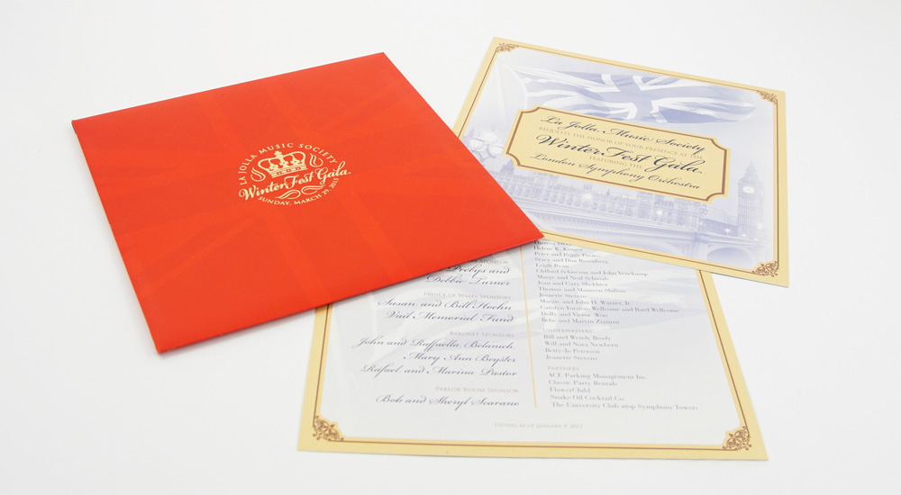
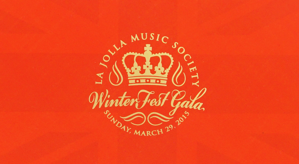
WinterFest Gala 2016
WinterFest Gala Invitation
Given a royal british theme for the gala, I wanted to make something stylish and modern but also capture some of the rich history and elegance as well. I created a seal like logo and we decided too have stamped in a gold foil on the front of the red enclosure which had a faint union jack on it. Inside were the invitation cards which had a more retro document look to them to contrast the more modern enclosure.
Season 47 | 2015-16 Flyer
I wanted to create a flyer that was bold, simple and would encompass the season. Deciding early on that using various images wasnt giving me the affect I wanted, I went with large bold text and added color to create separation between the words. I then filled in some of the bottom space with small pictures of some key performers we wanted to highlight.
Season 47 | 2015-16
Montreal Symphony Orchestra Graphic
I needed to create a graphic for the Montreal Symphony Orchestra (Orchestre symphonique de Montréal) performance that highlighted the music director Kent Nagano, but also star pianist Daniil Trifonov while giving a nod to the orchestra itself. I decided to combine the three images, and have them almost cradle the text in the middle. I went with a sans-serif font to give it a more modern look as well. This was used for a poster, New York Times insert and a simplified version was used for web ads.